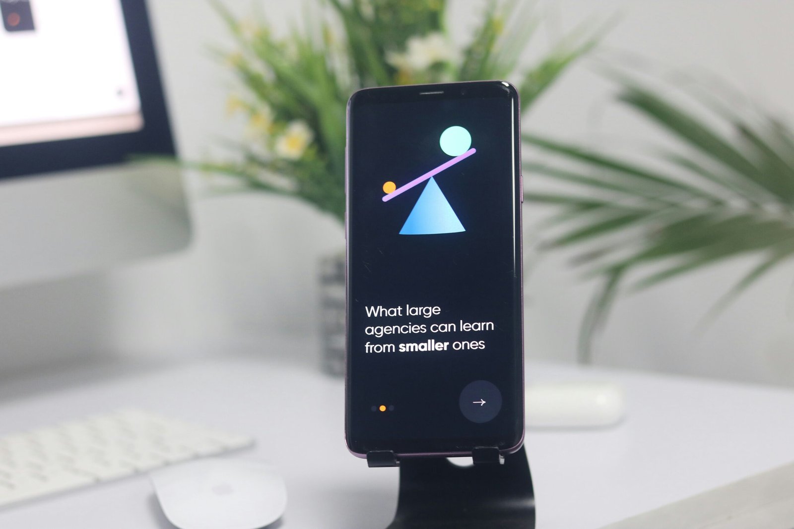
Your onboarding screen is the first true handshake between your product and your user. And while colors, copy, and illustrations often take center stage, there’s a silent force that shapes how users feel and flow: typography.
In particular, onboarding screen font choices can determine whether users feel welcomed, confused, or inspired. Fonts aren’t just visuals — they’re a functional layer of communication that supports clarity, speed, and emotional tone.
This guide shares 8 practical tips to help you make better onboarding screen font choices, improving user flow, brand perception, and first impressions. Whether you’re designing for a startup, a SaaS dashboard, or a lifestyle app, the right fonts on your onboarding screen make all the difference.
1. Align Your Onboarding Screen Font Choices with Brand Voice
Your onboarding screen is your brand’s first conversation with the user — a silent introduction that sets the tone for what’s to come. And while visuals and copy play their part, your onboarding screen font choices quietly shape how your product is perceived, even before the user reads a single word.
Fonts are more than decorative elements. They express personality, signal intent, and create trust. A font can say “we’re serious and reliable” or “we’re fun and creative” without ever speaking aloud. That’s why aligning your onboarding screen font choices with your brand voice is not just smart — it’s essential.
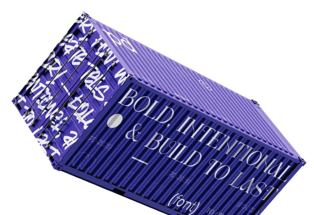
Let’s break this down. Think about a fintech app. Users expect stability, security, and clarity. The font used in the onboarding screen should reflect that — something like Inter, SF Pro, or DM Sans will communicate professionalism and efficiency. On the other hand, a language-learning app that wants to feel friendly and playful might choose fonts like Poppins, Nunito, or even a custom font from Phoenix Dungeon’s soft display collection, to convey warmth and approachability.
When choosing your onboarding fonts, ask:
- Does this font reflect our brand’s tone (e.g., serious, bold, elegant, quirky)?
- Will this font make users feel what we want them to feel?
- Is there a disconnect between the emotional intent of our message and the appearance of our typography?
If your brand is bold and modern, your fonts should be clean, confident, and contemporary. If your brand is soft and nurturing, your fonts should reflect that through rounded forms and softer contrast.
Here’s a closer look at what font choices might look like across different brand personalities:
- For serious SaaS and fintech products: Choose strong, clean sans-serifs. Fonts like Ursulla, Catalisa, or Qumelan (by Phoenix Dungeon) are great for conveying clarity and control.
- For lifestyle or creative brands: Use expressive, warm fonts. Consider Raigab, or Nazarena, to bring elegance and individuality to your onboarding flow.
- For youthful, energetic brands: Go bold and dynamic. Fonts like Arteche, or Udeyna, bring personality and punch to your welcome screens.
The goal is simple: make sure your onboarding screen font choices support the voice your brand already speaks. A calm wellness app using a loud, sharp font will feel confusing. A cyberpunk-themed game using a basic system font will feel generic. Consistency between message and medium is key to gaining trust from the very first screen.
When your fonts feel aligned with your visuals, messaging, and voice, the onboarding experience becomes cohesive — even comforting. Your users won’t have to think about why they trust you — they just will.
And don’t forget to test your fonts with real users. What looks bold on your screen might feel aggressive to others. What feels stylish to your team might feel hard to read on mobile. Your onboarding screen font choices should not only align with your brand but also with how your audience perceives and interacts with it.
🧠 Quick Thought: Fonts are emotional messengers. The right font doesn’t just carry text — it carries meaning, tone, and trust. So if your brand is proud, modern, and bold, your onboarding screen font choices should say exactly that, without compromise.
If you’re seeking fonts that match specific moods and brand voices, explore the handcrafted typefaces at Phoenix Dungeon. From futuristic serifs to gentle sans-serifs, there’s a font family for every brand personality — all optimized for impactful onboarding experiences.
2. Prioritize Legibility on All Devices
One of the most important rules for onboarding screen font choices is legibility. Users don’t sit down to read your screen — they scan it. And if your font is hard to decipher, they’ll skip it.
Make sure your fonts:
- Have good letter spacing (not too tight)
- Maintain clarity at small sizes
- Have open counters and distinguishable glyphs (e.g., clear difference between “l”, “I”, and “1”)
👀 Test it yourself: Shrink your onboarding screen to 320px and see if your text still reads clearly.
3. Use a Font Hierarchy That Guides the Eye
Don’t overwhelm users with walls of text. Use a clear font hierarchy to structure your onboarding screen:
- Headline font (Bold, 24–32px)
- Subtext font (Regular, 16–18px)
- Caption or helper text (Light, 12–14px)
Your onboarding screen font choices should help the user scan from top to bottom naturally.
Design Formula:
- 1–2 font families max
- Use 2–3 weights: regular, medium, bold
- Avoid switching fonts mid-flow unless for very intentional contrast
🧭 Typography = navigation. If your font layout is chaotic, your flow will feel chaotic too.
4. Optimize Font Color and Contrast for Accessibility
No matter how beautiful your font is, if users can’t read it, it fails. A huge part of smart onboarding screen font choices is about ensuring visibility for everyone.
Quick wins:
- Avoid low-contrast color combos like gray-on-white
- Use WCAG AA contrast ratios (min. 4.5:1 for body, 3:1 for large text)
- Avoid overusing ultra-light or hairline fonts
💡 Tip: Check out Phoenix Dungeon’s retro-bold fonts if you want strong headlines that maintain accessibility standards while adding personality.
5. Think Multilingual: Use Fonts That Support International Characters
Will your product serve users in different countries? Then your onboarding screen font choices must support multiple languages — including non-Latin alphabets.
Poor font rendering in Thai, Arabic, Japanese, or Cyrillic can break your layout and destroy trust in seconds.
What to check:
- Does the font support extended Latin and global characters?
- Are line heights dynamic and appropriate for different scripts?
- Does your fallback font visually match your main font?
🌐 Font Pairing Tip: If you’re using decorative fonts for headings, pair them with system fonts for body text to ensure localization doesn’t break consistency.
6. Match Font Mood with Onboarding Tone
Your onboarding screen sets the emotional foundation for how users perceive and interact with your product. Whether the experience is meant to feel calm and supportive, energetic and fast-paced, or formal and authoritative, that tone must be expressed visually — and fonts are one of the most powerful tools to do so. The right onboarding screen font choices will evoke the intended mood instantly, guiding user emotions without the need for overt explanation.
Typography, at its core, is not just about legibility. It’s about feeling. Every curve, weight, and spacing choice carries emotional information. A sharp, angular font conveys urgency or control. A soft, rounded typeface radiates friendliness and approachability. A tightly spaced, narrow font may feel intense or fast-paced, while a wider, more open typeface suggests calmness and breathing room. These subtleties shape the onboarding experience in ways users might not consciously realize, but they absolutely feel.
When your font mood matches your onboarding tone, users flow effortlessly. They intuitively understand what kind of interaction they’re about to enter. This harmony creates emotional resonance — a powerful connection between brand and user that begins in the first few seconds of onboarding.
However, when the font mood clashes with the onboarding tone, that connection is lost. A disconnect between what users see and what they feel can cause hesitation or even mistrust. The brain picks up on these inconsistencies fast. The onboarding screen might say “Welcome!” — but if the font feels cold, jagged, or aggressive, users won’t feel truly welcomed. They’ll feel tension instead of clarity.
That’s why your onboarding screen font choices should never be an afterthought. They should be chosen with intent and awareness of the emotional landscape your brand is creating. Tone is not just communicated through color palettes, illustration, or microcopy — it’s etched into every letterform your user sees.
Achieving this alignment begins by asking foundational questions during your design process:
- What is the emotional tone we want our onboarding screen to convey?
- Are we trying to motivate, comfort, inspire, or instruct?
- Do the typefaces we’ve selected support that emotional goal — or do they conflict with it?
When your answers are clear, your font choices become more than a visual accessory — they become a psychological strategy.
Consistency between tone and typography also strengthens user confidence. People trust brands that feel cohesive. If every element — from your copy to your font — speaks in one clear, unified voice, users are more likely to move forward in the onboarding flow, commit to completing steps, and return again later.
This kind of harmony also reduces friction. A mismatched font doesn’t just look off — it forces users to think harder about the interface. It interrupts the subconscious flow and creates mental noise. But when font and tone are in sync, the onboarding process feels smooth, intuitive, and emotionally intelligent.
Your onboarding screen font choices are a reflection of your product’s soul. If you want your onboarding to feel warm, soft fonts with generous spacing help create that mood. If you want it to feel driven and focused, fonts with precision and restraint deliver that sensation. The goal is not just to look beautiful, but to communicate clearly and emotionally.
Ultimately, font mood and onboarding tone should feel like a natural extension of each other. When that synergy is present, users don’t notice the typography — they simply feel understood. They feel like they’re in the right place, with a product that gets them. And that emotional alignment can be the difference between a user completing onboarding or closing the app forever.
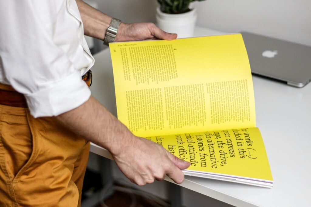
7. Use Custom or Display Fonts Sparingly for Impact
While it’s tempting to use eye-catching typefaces, onboarding screen font choices must prioritize clarity over cleverness.
Display fonts or custom fonts can help you make a bold first impression — but use them strategically.
Best practice:
- Use a custom or branded font only in the hero headline or screen title
- Use a neutral sans-serif for body and support text
- Keep file sizes light — too many font files = slow onboarding load times
8. Test, Iterate, and Monitor User Reactions to Font Choices
The only way to know if your onboarding screen font choices are working is to observe your users.
Track:
- Scroll behavior on onboarding screens
- Drop-off points during reading or interactions
- Feedback from A/B testing font pairings or weights
👨🔬 Consider running live UX tests with 2 font systems. One might improve reading time, while another boosts visual trust.
Tools like Hotjar, Maze, or Lookback are perfect for validating typography choices in real-time onboarding contexts.
🔚 Conclusion: Font Choices Shape the Onboarding Flow
When you neglect your onboarding screen font choices, you risk confusing, boring, or losing your user at the very first touchpoint.
But when you choose wisely, fonts become a guide — leading users gently, confidently, and clearly through the experience.
To recap:
- Align font with brand tone
- Prioritize legibility and contrast
- Guide the eye with hierarchy
- Consider language and accessibility
- Match font style with mood
- Use custom fonts with discipline
- Validate fonts with real users
The right font at the right time doesn’t just look good — it creates trust.
✨ Explore the Perfect Font for Your Onboarding Screen
Looking for fonts that blend personality, legibility, and design precision?
Phoenix Dungeon offers a curated collection of handcrafted typefaces perfect for:
- App onboarding
- SaaS dashboards
- Landing pages
- Branding and UI kits
From bold display fonts to minimal sans-serifs, every typeface is built for clarity, character, and creative expression. Whether you’re designing playful walkthroughs or professional enterprise flows, your onboarding screen font choices should never feel like an afterthought.
🎯 Don’t let weak font decisions hold your product back — browse the full Phoenix Dungeon collection and upgrade your onboarding experience today.
Need Expert Help with UI/UX and Brand Strategy?
If you’re looking to go beyond fonts and build a seamless, emotionally aligned onboarding flow, Layerice is here to help. As a branding and UI/UX agency, we specialize in turning ideas into pixel-perfect user journeys. From visual identity to onboarding optimization, we help founders and product teams deliver unforgettable first impressions.
💡 Make your onboarding screen font choices part of a larger, strategic brand experience — visit Layerice and let’s bring your product to life.